UX/UI Project
Next Door connects local communities online.
Now it’s time to turn online connections to real ones.
Executive Summary

As part of a UX/UI course with General Assembly, this project proposes a redesign and expansion of Next Door - a local social-networking app - to facilitate more in-person connections.

My Role

Working in a team of 3, responsibility was shared for all stages up until low-fidelity, after which I took full ownership of visual design and the final prototype.
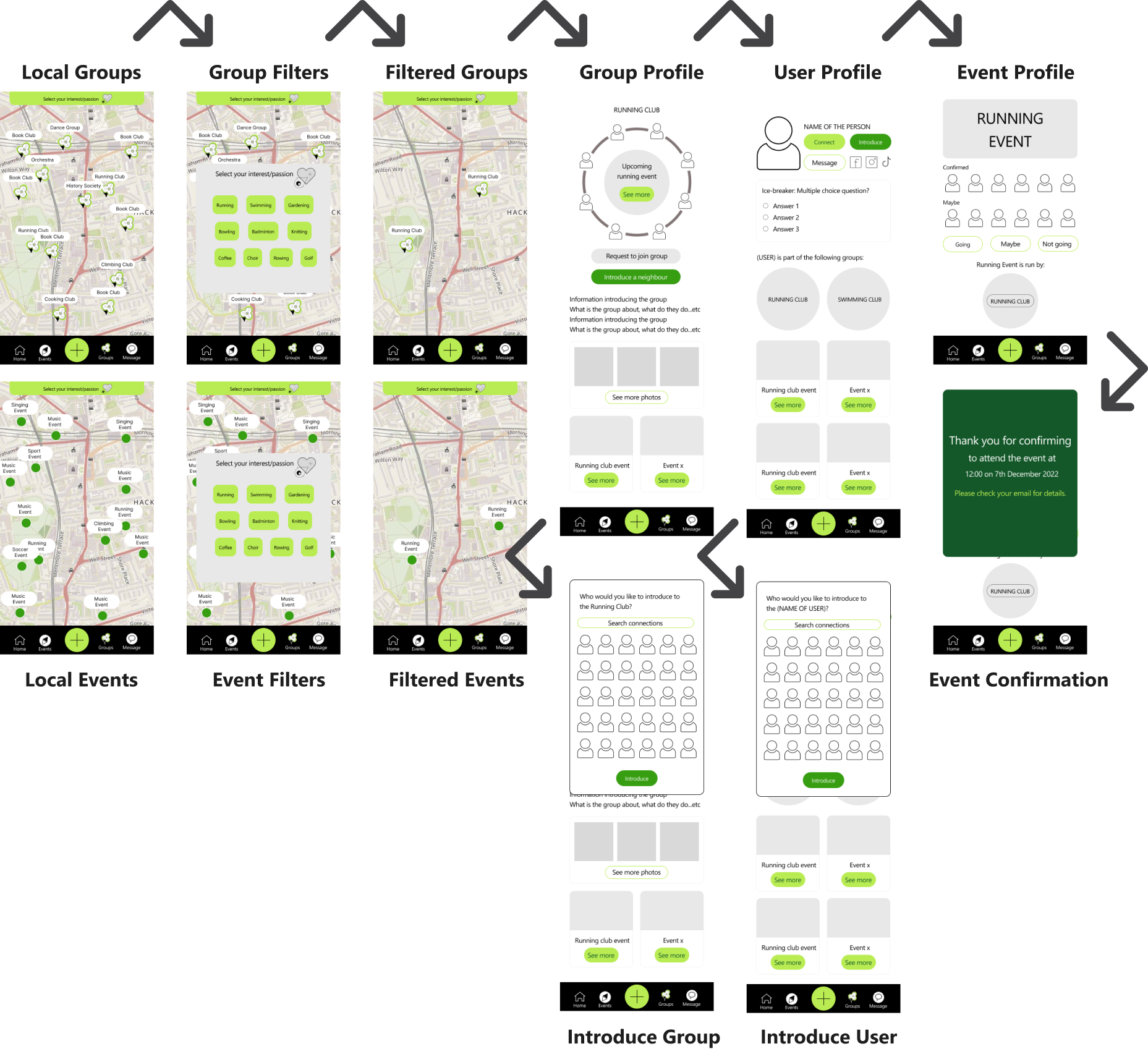
The Problem

We were tasked with exploring ways to encourage users to meet physically, improving the functionality of their ‘connect with your neighbours’ feature. From a user perspective, we found there was an appetite to make new meaningful friendships, but a lack of trust with strangers online, impeded such connections from forming.

The Solution

Research showed users made friends most commonly through existing friends or in interest groups/affiliated events. Our recommendations thus include:

Introduce mutual connections. Allowing the ability for people to introduce connections to other connections/groups to promote inclusiveness.
More information, more trust. Give information about people if they share information about themselves first to build trust.
Expand/emphasize the group function. Prioritize showing people as part of a group to make them more approachable.

The Brief

Nextdoor is a local social networking service for neighbourhoods, providing a digital platform for users in each ‘neighbourhood’ to communicate with one another. Currently, users can buy and sell goods, advertise local services, and discover events in their area.

Our brief was to explore ways to encourage users to meet physically. This includes

  • Improving the functionality of the ‘connect with your neighbours’ function.
  • Finding a way for users to match with and meet in person with neighbours based on their hobbies and passions and create a network.
  • The ability for users to create, organise and participate in in-person events based on these passions.
  • Exploring the ability for users to set different levels of privacy.
Nextdoor state:
‘There is a need for people to connect more at a local level and a real need to facilitate in-person connections
Existing Nextdoor interface

1

Initial Research

Competitors Focus on Interests

A feature inventory and a plus-delta analysis was conducted in better evaluating the market context of Next Door. More direct competitors, such as Meet Up, have a strong emphasis on interests and groups, with user interest selection built into the onboarding process (1) for relevant suggested groups at sign-up. Nextdoor by comparison have more of a focus on local events and individuals near you. We inquired further about these various social features in user interviews.

What can we learn from dating apps?

A comparative analysis focusing on dating apps, which, notorious for facilitating in-person connections, gave us insights into how users can ‘break-the-ice’ by utilizing techniques such as including multi-choice questions on their profiles (b) or voice-notes to build trust.

1. Meet-Up prioritizes interests and groups
2. Hinge incorporates multi-choice ice-breakers questions
Interviewing the Users

To understand the sociological and psychological context of making social connections further, we conducted ten user interviews and one contextual inquiry.

The latter process involved (remotely) observing a user organising to find and join an event on Meet-Up to make new connections, reflective of his typical behavior. The user showed interest in the people in each group when choosing a group to join; analysing their profile photos in deciphering demographic information, how they looked like, and how many of them were attending.

Friends Trust Friends of Friends

After synthesizing all our user research data through affinity mapping, several prominent trends came to the fore. Overwhelmingly, users made new friendships through existing connections, or hobbies and interest groups, in person; it appeared more rare to make new friends online due to a lack of trust in strangers. Rather, trust is higher for a stranger if they shared a mutual friend, or is affiliated to a group.

Additionally, and somewhat dichotomously, users trusted people with more online information, yet is selective about the information they share themselves.

2

Defining the Problem

‘Clare needs a way to meet new like-minded people because she does not want to feel lonely but she lacks trust in strangers
Problem Statement

The above problem statement distils the overarching sentiment of our user interviews. We found interviewees, particularly when moving to a new city, seeked people with similar outlooks and interests. Those without existing social networks seeked friends to not feel lonely. And a lack of trust in strangers for all interviewees discouraged them from meeting up in-person.

User Personas

Our problem statement and research insights evolved to form our primary user persona, Clare, a newcomer to London looking to make new friends (below). Our user research also pointed to a secondary user persona: the established, well connected citizen who was not looking to make new connections, but keep informed in the neighbourhood and reinforce existing relationships.

3

Ideation

Design Studio

Using the defined problem statement as an initial framework to ideate from, and considering our user research findings, we ran a group design studio, generating numerous ideas for discussion.

The main ideas centred around the prioritization of groups and making visible the people within those groups, as well as the idea of introducing mutual connections. We distilled six main concepts:

a. Expand and emphasize the group function as its own section of the app, organised by proximity to the user.

b. All events to be people-centric, prioritizing who is going and mutual connections most visibly.

c. Prioritize showing people as part of a group to make them more approachable.

d. Give information about people if they share information about themselves first to build trust

e. The inclusion of ice-breaker games on user profiles, making initiating first contact more seamless.

f. Allow the ability for people to introduce connections to other connections/groups to promote inclusiveness

4

Testing & Iterating

Initial Wireframing

The concepts that came through from the design studio were captured in the wire flow illustrated below. The prioritization of groups led to a group finder by location (and related filters), and a detailed group profile page. An ‘Introduce’ function was also built into the group profiles and user profiles, should a user wish to introduce these to a friend.

Testing the Concept

Five monitored usability tests were conducted remotely on a low-mid fidelity prototype. We were interested in testing the feasibility of using groups to meet people in-person, as well as the function of introducing people to each other.

Task 1: Find a way to meet up with a group of runners in person.

Task 2: Introduce your friend to the local running scene.

Reducing Cognitive Load

Several alterations were made in response to results and insights from usability testing. For example, 3/5 participants had confusion or increased cognitive load with the ‘Introduce a neighbour’ function. This resulted in the following changes:

a. ‘Introduce a neighbour’ was separated from ‘Request to Join’ in a pop-down menu to reduce cognitive load on the main screen. Also relabeled as ‘Share group’, a more familiar industry term.

b. The primary call-to-action button ‘Request to join’ moves to the centre of the circle, utilizing its geometric advantages to focus the users attention, leaving no buttons surrounding/competing with the circle motif.

5

Visual Design

Colour

Nextdoor have an existing colour palette of mostly greens and greys, with a purple accent utilized for events.

The greens work successfully in evoking the idea of growth and the hues feel optimistic and friendly. I have therefore maintained the primary lime green accent for the main call to action buttons.

I have utilized the mid-green accent colour for the ‘introduce’ function, reflecting this idea of growth and growing connections.

To emphasise the group feature, I introduced a new yellow hue, which like events in purple, have an energetic and playful feel to it, reflecting its categorization as a ‘social’ function of the app.

Design Motifs

The aim visually is to encourage users to connect with others, in particularly groups. As such, groups have to feel approachable and friendly.

We utilized the motif of a circle to embody the ideas of equality and inclusivity, as well as bring up the image of a friendship circle.

The circle can also been used to focus the users attention to a particular call-to-action button or piece of information.

"It keeps everyone balanced on the same ground and not a hierarchy"

a. Group Map Symbol

The symbol is an abstract representation of three people linked together by a circle. The number of group members is at the centre (user research response).

b. Group Members Circle

The group map symbol (a) conceptually parallels the larger group members circle; the smaller black circles become user profiles, as if it were increasing in fidelity once a user clicks into the symbol.

c. Group Pictorial Icon

The group icon on events and users profiles is kept bold and minimal. The circled image differentiates it to the squared image of event icons.

6

Latest Prototype

Group/Event Finder
Group Profile
User Profile
Event Page

7

Critical Review

Overview

At the heart of this project was the study of the human need for connection, a subject I find particularly intriguing amidst a growing epidemic of loneliness. Tech has the power to enable more meaningful relationships and this project was a somewhat heuristic process for me, forcing one to ask, what really drives humans to form social connections? Why are people afraid to connect to others today?

The process ran smoothly and to schedule overall. We tackled each stage of the double diamond methodically, and split tasks to suit each of our strengths. We were a particularly discursive team, debating each research insight and idea development along the way; this ensured every move was backed with critiqued justification, but also proved time-consuming.

Did our work answer the brief?

Our solution meets the overarching sentiment of the brief in terms of encouraging users to meet physically, but divulges from some of the suggested ways of doing so. Whilst the brief asked us to explore a way for users to match with and meet in-person with a neighbour, our research strongly suggested people do not feel comfortable meeting strangers one to one, hence our proposal for people to meet through groups. Should it be a live client, a discussion on the brief would have been recommended, prior to ideation.

Key learnings
  • For B2C products, it felt easier to empathise with the users and their underlying motivations; most of the team, myself included, knew how it felt to be in a new city wanting to make new social connections. Our own experiences can help with the UX process, yet we should also be aware of the assumptions we are more likely to project onto others in this case.
  • Ensure one asks enough ‘why’s’ to determine the root motivation of the user. When defining the user problem, we found our user research could not conclusively determine this underlying motivation (we proceeded with an assumption and tested this assumption during usability testing).
  • Consider how familiar a user will be with an app when deciding what features to prioritise visually. For example, the ability to introduce a group to a friend assumes the user would already have used the app long enough to have friends to introduce groups to; placing this function within a kebab menu allowed space around core features for less familiar users.